


Designer Emma Doucet has built a solid reputation for her ability to bring interior spaces to life with colour and pattern. Her business, Grassroots Design, located on the corner of Sherbrooke and Gladstone Avenues in trendy Hintonburg, is now a stockist for Farrow & Ball. She first took note of the paint and paper company as a client, recalling that, “I fell in love with Farrow & Ball paint 13 years ago when I painted my then infant daughter’s room Teresa’s Green. I noticed that I got 3 colours for the price of 1. The way the paint responded to sunlight meant it went from light green to light blue to blue/green. I was totally hooked.”
Her passion grew to include a love of their wallpaper too. Each pattern is painted on, which gives it the rich handmade texture that it’s known for. Wallpaper has made a significant comeback in the past years and isn’t showing any signs of fading away; in fact, it’s quite the opposite.
“It’s like installing a giant piece of art on your wall,” offers Emma, who often adds pattern to walls in intriguing ways. It’s not just about papering a room or even one wall. Designers are using papers as a backdrop to create texture and draw the eye to architectural detailing.
Floral prints are wildly popular right now. They bring a space to life quickly with colours and vibrancy that relate to nature. Emma ad-vises that balancing a heavy patterned paper by pulling out colour from the print to paint the walls will ensure a well-dressed space. “You want the paper and the wall colour to speak to each other,” she adds.
Find big bold printed-paper murals and apply them to wide-open spaces. Balance is the key to creating a look that feels done, not over-done. This holds true with the metallic papers that have emerged on the scene. Emma cautions that it’s important to pay attention to the quality of the paper if you do decide to go with the metallic look. “They can look like Christmas wrapping paper,” the savvy designer warns.
Solid Advice
While today’s papers are often pre-pasted many installers find them to be thinner than the non-pasted. “A good installer likes a slightly thicker paper for the quality and ability to match patterns at the seams more easily,” states Emma, who isn’t afraid to use wallpaper in high traffic areas. “A good quality paper can be wiped off in the same way as a painted wall,” she notes.
Emma’s Top Five Wallpaper Tips:
- Create an accent wall in places, like behind a bed or above a fireplace.
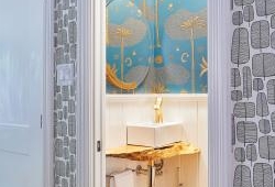
- Use wallpaper for smaller spaces, like powder rooms and entranceways, to transform a tiny, boring space into a spectacular one, without interfering with other rooms.
- Divide rooms with panelling to paper just half the wall.
- Paper ‘awkward,’ small walls (like the one at the top of your stairs) to create visual interest, without great expense.
- Put wallpaper behind shelving to add a pop of colour and pattern.
 Mary Taggart


